plan business
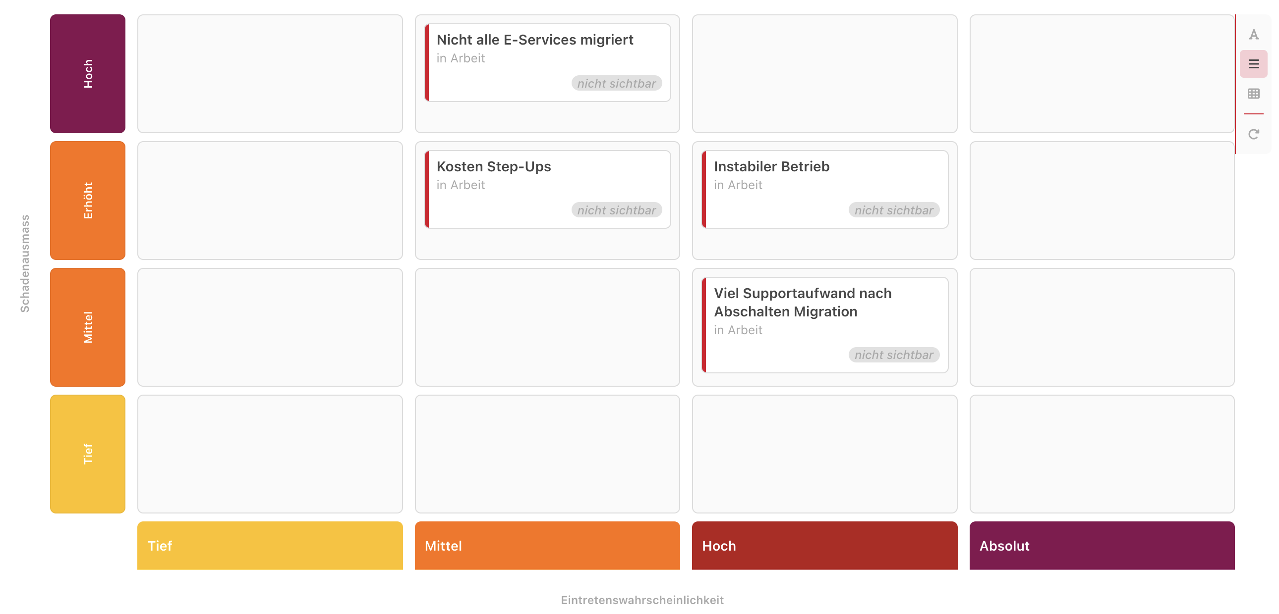
You can visualize Phonemos objects as cards in two dimensional boards based on meta data fields. Classic examples of such matrices are:
Kanban boards
Risk matrix (probability / impact)
Idea priorization (business value / effort)
User Story Mapping boards
Some of these methods are described in Methodology Glossary if you would like a quick intro.
Adding a board
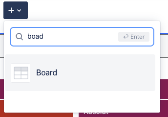
You can add such a matrix with the Board widget.
Example:
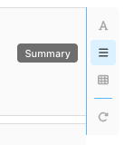
View mode options
On the right side of the board, you have the following options:
You can choose between three levels of verbosity the card is displayed:
Title only
Summary
Full
The reload button refreshes the matrix if some items might have changed in the background.
Selecting what cards to visualise on the board
To visualise cards on the board, you need to configure data sources. Data sources are basically just a query over metadata that selects all items you want to display.
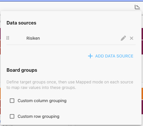
Please note that you can select multiple facets with your data sources and these will not always share exactly identical column or row values, e.g. use a different status model. With the custom column and row grouping, you can display multiple field values in the same columns or rows (e.g. done, completed and finished are all shown under the same column).
Mapping columns and rows
You can list several data sources. When you add a data source, you have the following options:
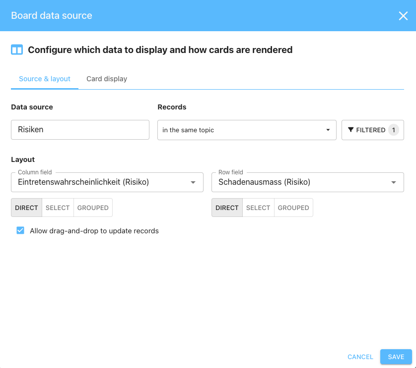
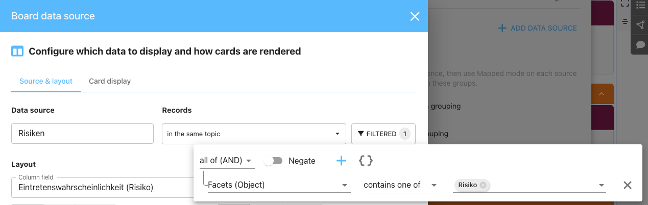
Data source: this is the query that selects all the items you want to display as a card on the board
Layout - column and row fields: here you select what metadata field of the objects you want to tie to columns and rows. If you want to create a risk board, you will likely select impact and probability. If you build a Kanban board for tasks, you will probably tie status to columns, maybe leaving the rows unused or maybe group stories by epics.
Note that you have three options for each field:
Direct: this will tie the field value directly to the column or row
Select: this allows you to select only certain of the values, e.g. you could filter the board to only show 3 out of 5 possible status.
Group: this allows you to group multiple values into a group that you want to display in the same column. For example, you may want to have a board showing Status. open → in progress → done, but in the done column, you have not only tasks that were actually done, but also items you rejected.
Allow drag-and-drop to update records: If not selected, this will be a read-only board. If selected, you can drag and drop cards and this automatically updates the metadata values of each card.
Mapping fields onto the card
In the second tab you can map metadata fields to the cards. Basically, you can potentially map nearly any number of fields onto a card, but of course the cards will grow very large, thus you want to be selective.
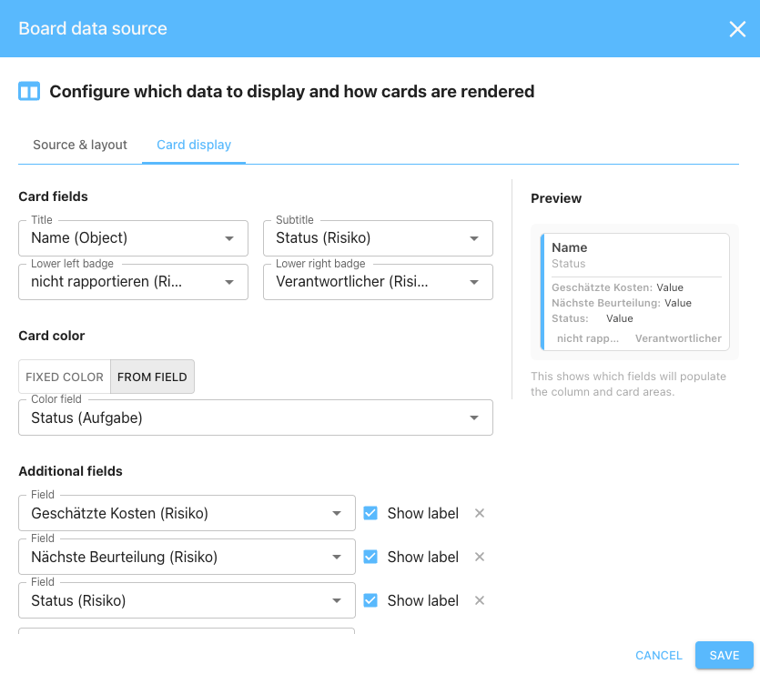
You have a couple of places where you can map fields into:
Title: This is the title section of the card, the text mapped here is shown bold. Most likely you will want to map the field “Name (Object)” here, thus displaying the title of the object.
Subtitle: This is displayed just under the title
Lower left badge: This displays a field in the lower left corner of the card.
Lower right badge: This displays a field in the lower right corner of the card. This is commonly used for the assignee field, but you may map another field there as needed.
Card Color: You may either give the card a fixed color, e.g. the one distintive color for each data source, or you derive a color from a field.
Additional fields: You can add any number of additional fields onto the card, they will be displayed after a line under the subtitle. If you have many fields, they may no longer be self-explanatory, so you can decide to show a label for each.
Adjusting the display options
In edit mode, you can change the display options via the eye-icon on the top right of the board.
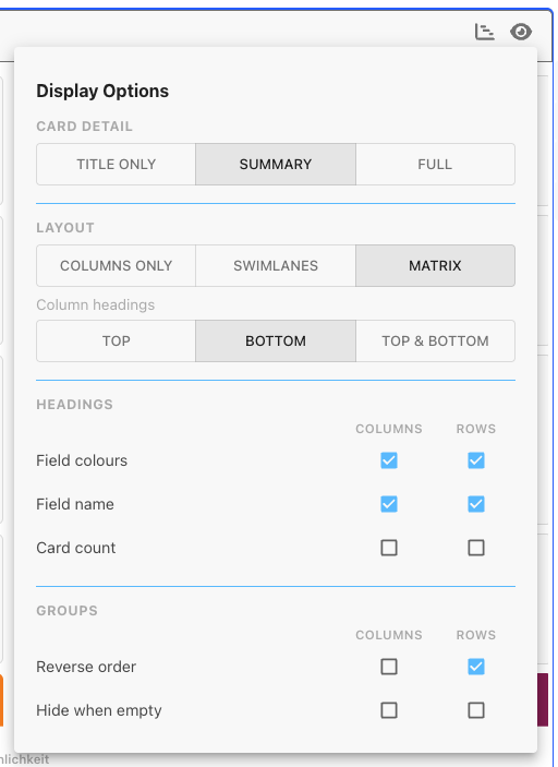
Card detail
You can choose between three levels of verbosity the card is displayed:
Title only
Summary
Full
What you select in edit mode will be the default setting for all users when they open the board the first time.
Layout
You may choose between three modes:
Column-only
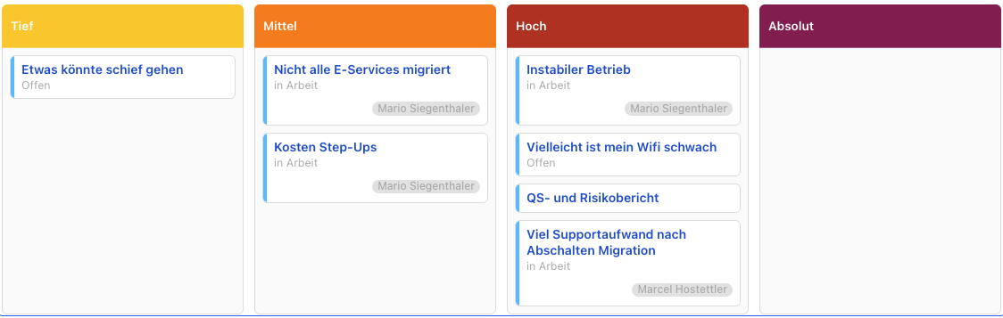
This is the classic, simple Kanban board.
Swimlanes
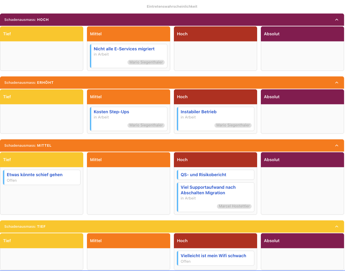
In swimlane mode, the columns are cut through horizontally by distinct horizontal titles. This is useful if you want to show items grouped.
Matrix
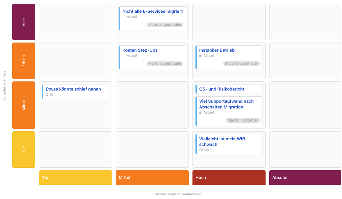
In the matrix mode, the labels are displayed so that you can put items onto sections along x and y-axis in order to build clusters of information, e.g. show risks with high impact and high probability on the top right..