PLAN BUSINESS
You can display charts based on metadata. Examples:
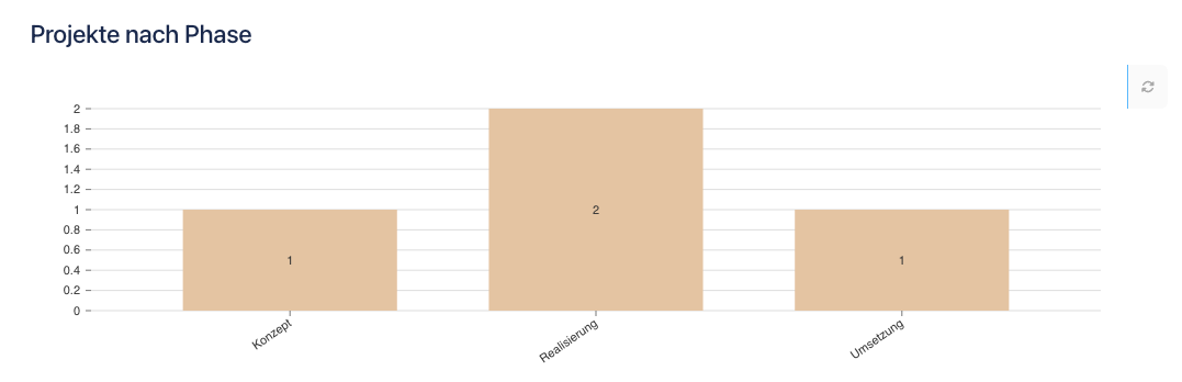
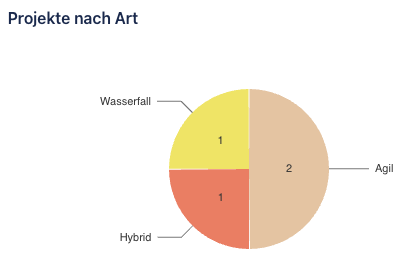
Adding a chart
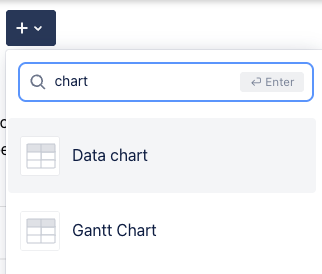
You can add a new data chart through the + menu or by typing /.
You can then configure the chart using the cog wheel on the top right.
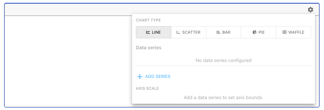
A chart is configured in these steps:
Select the chart type
Select the data series you want to display as a filter
Modify the display, different options exist per chart type
Line charts
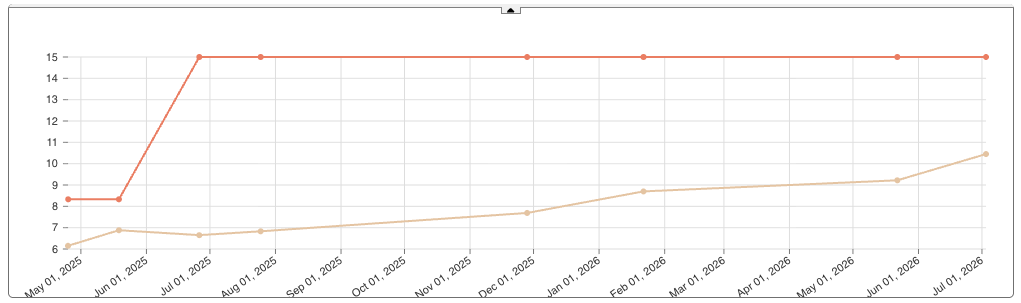
Let’s assume we have a time series that will display the development of a KPI over time.
In step 1, we need to add the data series, in this example we show an actual MRR compared to a minimum threshold.
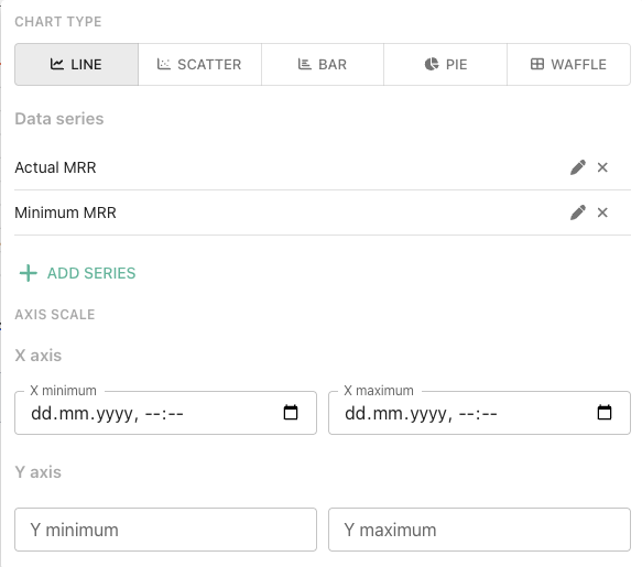
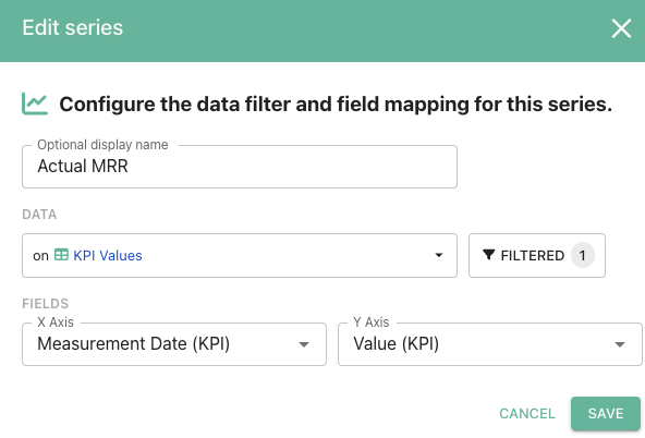
You may adjust minimum and maximum axis. The resulting chart is:
Scatterplot
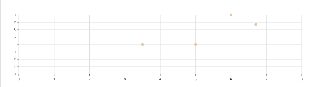
Most of the configuration is the same as for the line chart, we only give an example of how it may look if you map two fields to x and y axis.
Bar chart
Most of the configuration is the same as for the line chart, we only give an example of how it may look if you map two fields to x and y axis.
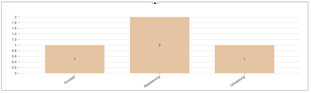
Bar charts support a custom grouping.
Pie chart
Most of the configuration is the same as for the line chart, but you can make a more detailed category configuration and you may choose if you want to display object count of summed up field values.
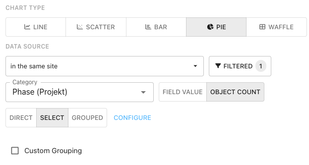
Waffle chart
The configuration is the same as for the pie chart. But it displays the values as a waffle chart.